
Magazine Advert Analysis
Kings Of Leon - Only by the Night
Kings of Leon's produced a magazine advert for their album 'Only by the Night'. This advert contains colours of white, black, green, blue and red, this is slightly different to a typical alternative rock advert as there are more colours than usual that are brighter as opposed to just the normal black, white and red. The main image is a collage of the bands faces and an owl which links to the title of the album as owls only come out at night. The fact that there is an image of the band doesn't follow typical codes and conventions as usually artists only include symbols and not pictures of the band however, Kings of Leon have done both. The fact that the colouring of the image is green-tinted suggests that it is an old picture.
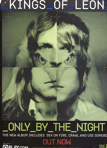
The thick, sharp font makes it easy to read and would grab the audiences attention. However, the unusual image placed in the middle of the magazine advert would grab people's attention even more. The fact that it's different conforms to the alternative rock genre as it is described as something that does not follow the norm and doesn't fit in with scoiety or its conventions. This advert contains details of songs within the album and where to play it which is helpful as it helps to promote the band and make their music as popular as possible.
Foo Fighters magazine advert for their 'Greatest Hits' album uses the same image for this advert as they do for the CD front cover. This is helpful as it allows the audience to recognise the album cover as well as the magazine advert and they can then identify that it is the same product that is being promoted and therefore, they are creating as much promotion for themselves as possible. The advert includes the name of the band at the top with big, black font however, some of the letters have different patterns in the middle of them that looks like lightning bolts. It is the same with the name of the album which is added underneath the bands main image. These shapes suggest the music is electric and exciting which is a positive connotation and something that the band would want their music to be associated with. Therefore, this conforms to the genre of alternative rock as rock is loud and alternative means something different and unconventional within society.

The main colours used are black, silver, red and white. These all conform to the genre as it is the colours that you would expect to see on an advert of this particular genre. The black font makes the writing stand out as does the white font which is placed upon a black background. This white writing lets the audience know when the album is released, how it can be purchased and some songs that are included. The main background image looks like a metal wall with bolts in, this suggests that the music and that band have a hard demeanour and their music follows the same idea. The main image that people would be drawn to most is the big, circular logo with 'FF' written in bold, black font and outline with white colouring placed on a red background. This image allows the audience to recognise whose advert it is as this band are popular and wouldn't need their name plastered everywhere in order for people to know who they are.